Catalina Club.

Brand Identity, TOV, Nomenclature / Naming, Wayfinding, Signage, Digital / Print Collateral and Brand Guidelines


In developing our initial brand design concept, we aimed to blend a classic country club aesthetic with a contemporary touch, drawing inspiration from the Club's natural surroundings. The goal was to strike a balance between tradition and modernity while honouring the inherent beauty of Club Catalina's environment.


Our design approach involved combining timeless typography with refined emblematic motifs, subtly updated for a contemporary feel. The resulting brand identity is visually pleasing and sophisticated, appealing to a modern audience seeking a mix of nostalgia and a forward-looking perspective.


Our Direction for the logo was inspired by the iconic "wave" of the porte cochère, a recognisable symbol for both members and locals. This distinctive shape reflects not only the Club's identity but also the coastal proximity and relaxed atmosphere of Batemans, emphasised by the inclusion of a flag motif.


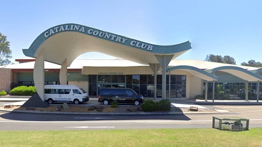
Taking cues from Club Catalina's renovated interiors, our design suggestions aim to enhance the contemporary Palm Springs vibe with subtle accents, thoughtful way-finding, and carefully curated elements. Incorporating greenery indoors adds a touch of nature, creating a fresh and vibrant atmosphere throughout the Club. This practical and cohesive approach ensures a design that captures the essence of tradition, modernity, and the Club's natural charm.


We are here to help.

Talk to us about your projects, plans and pipelines today.


In a world of vegan, paleo, vegemite madness — Mrs Fields

View case study

Connected to what counts
— River Realty.

View project

The Drawing Arm.

View case study