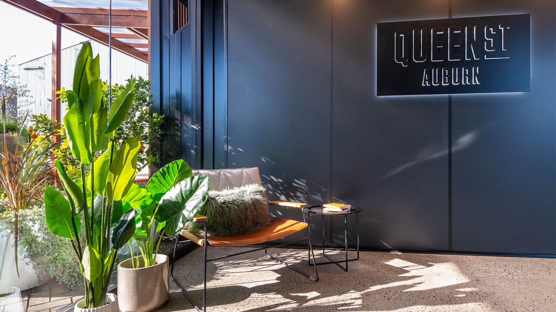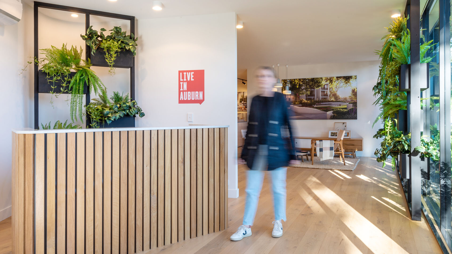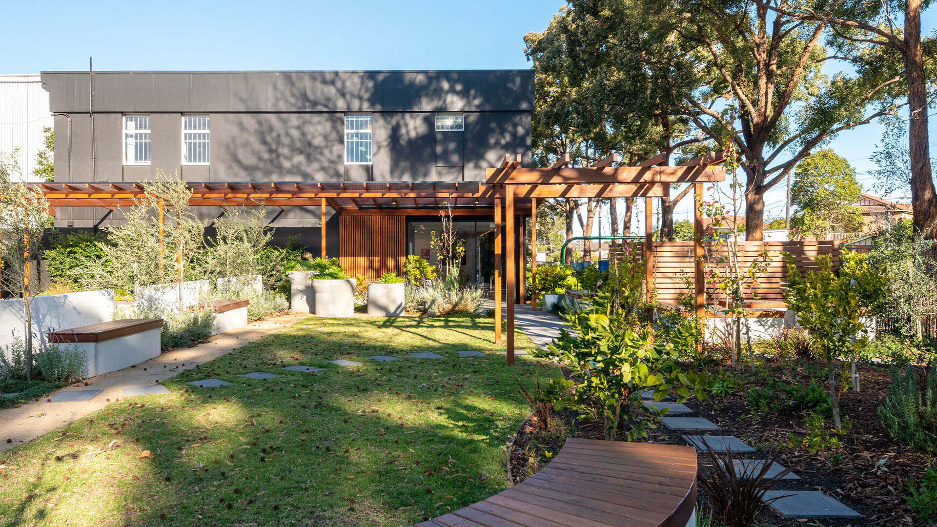

Queen St, Auburn
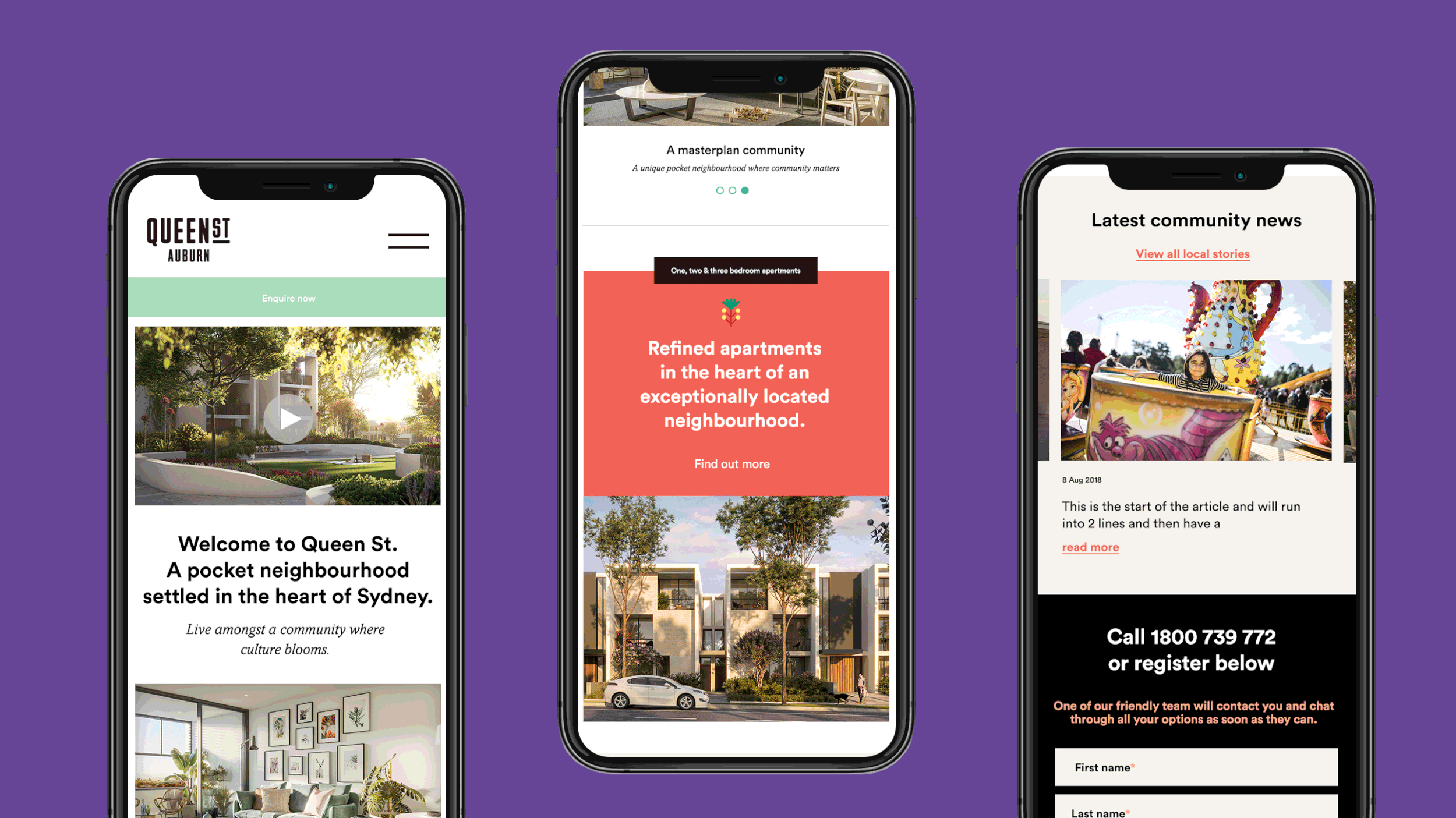
Brand strategy, naming, visual identity, property marketing collateral, digital front-end and brand guidelines.
A place to be proud of.
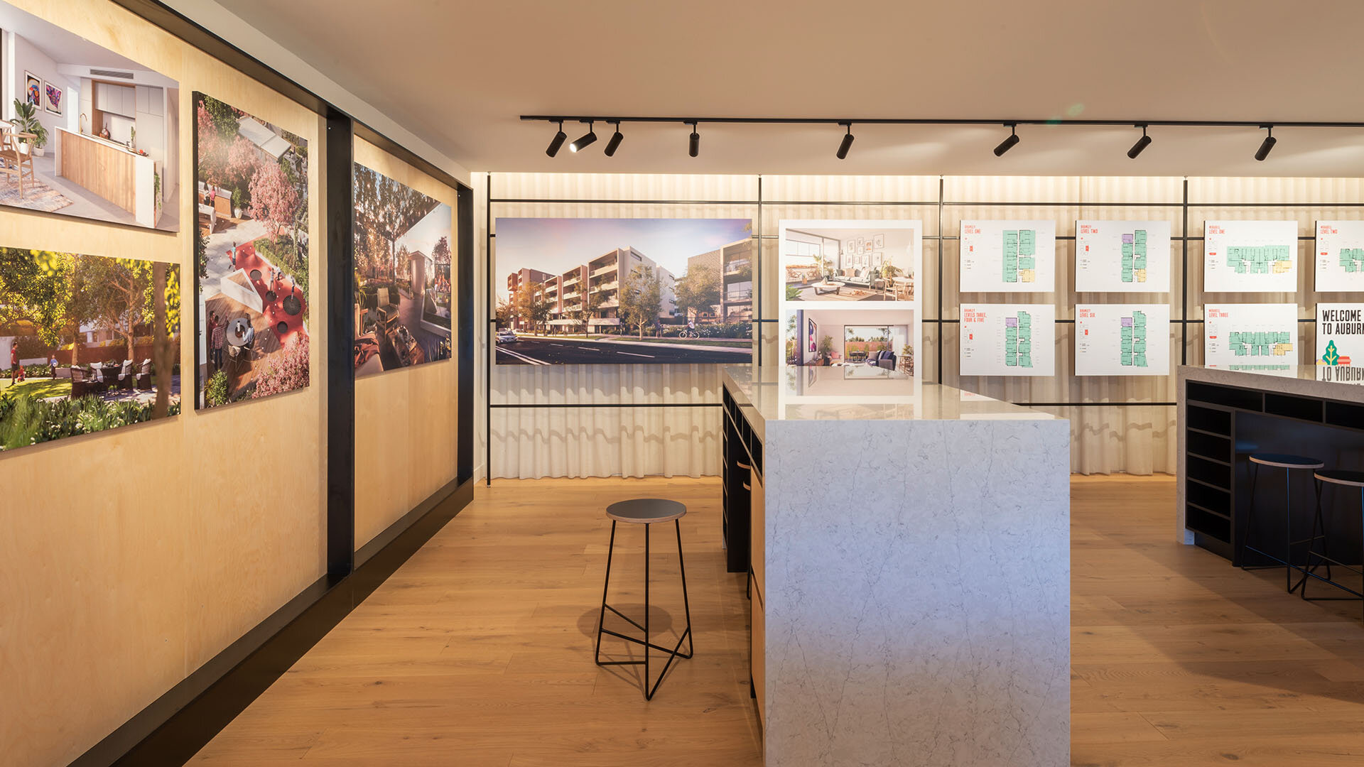
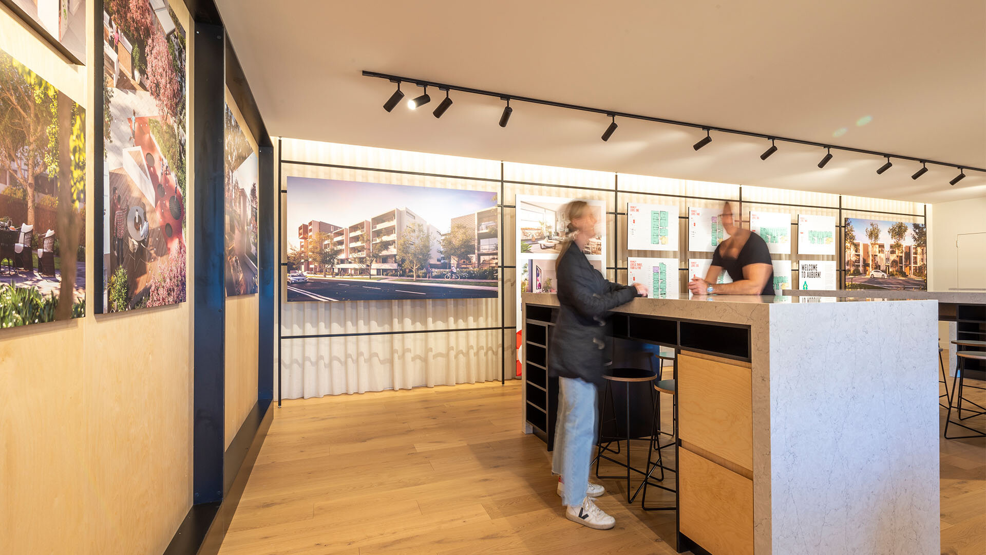
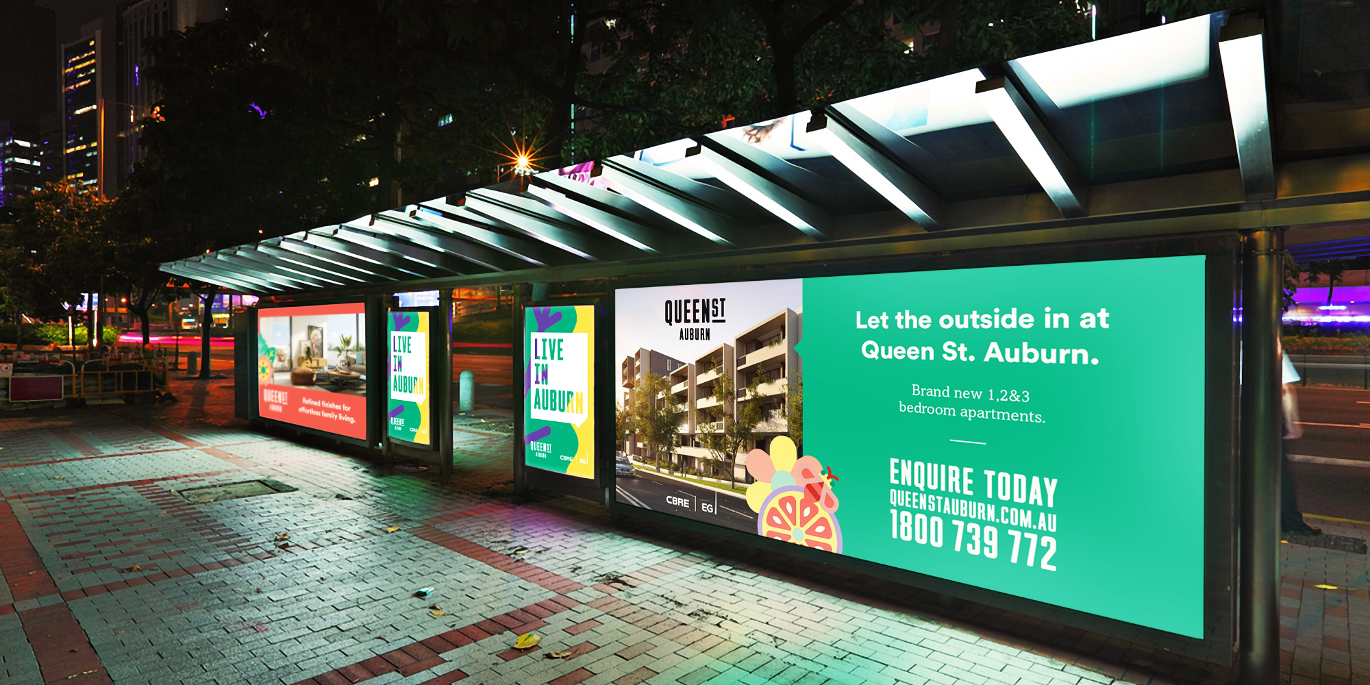
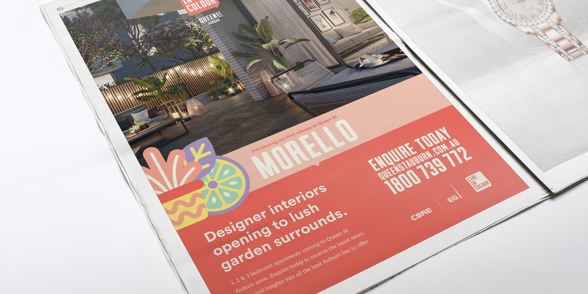
Delivering a confident, honest and bold visual identity that captures the essence of the Auburn community. To celebrate Auburn’s sensory richness, we partnered with a number of geniuses to give this project the personality and life it deserved. This included teaming up with street artist, already much loved by the people of Western Sydney, Nico. Bright, strong and distinctive, Nico’s visual style brought the essence of Queen Street to life, creating a strong brand across all touch points. Nico’s custom-made vector images feature on the development’s website, brochures, marketing materials, and even on its way-finding.


Celebrating Auburn’s sensory richness.
One of the things that makes this development so special is its location – right in the heart of vibrant, gritty, culturally diverse Auburn. The brand strategy and campaign awareness created for this project has been described by industry expert Tim Rees, Senior Director at CBRE, as ‘clever, authentic and effective’.